|
American Beer Month
The art of the label

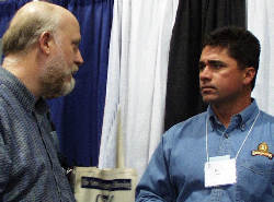
Randy Moshser (left) a a potential client |
There was passion in Randy Mosher's voice. He could have been talking about beer. He could have been talking about typography. In fact, he was talking about both.
"Things got nasty at the beginning of the (20th) century," he said.
National Prohibition was on the way, and the golden age of typography was nearing an end. Those were not the good old days.
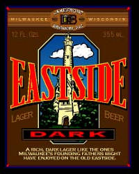
Curiously, Mosher sometimes creates graphics for craft brewers that tap into sentimental feelings, even though neither the times nor the beers may have been all that great.
"You connect in people's minds," Mosher said. "What would Grandpa have drank if he could?" He stopped to think about how that beer probably tasted, or maybe what Grandpa might have thought about today's craft beers. "It's a lie. It's our nostalgic view of the past."
It wasn't that long ago that some craft brewers sold beer with packaging about as fancy as homebrewers use to haul bottles to a club meeting. While a few keep it almost that basic today, more realize that when consumers care about the label they may be more inclined to care about the beer.
 
Mosher offered a presentation on "Microbrew Label Redesigns in the 1990s" during the Craft Brewer Conference earlier this year. After working for nearly 20 years in corporate advertising, Mosher started his own agency in 1991. About half the work he does today is for microbreweries.
"It's certainly my favorite part," he said.
Mosher is well known in brewing circles. He writes a regular column about homebrewing for All About Beer Magazine and his "Brewer's Companion" is an essential addition to any homebrewer's library. He recently was re-elected to the American Homebrewers Association Board of Advisers.
In his statement before the balloting, he wrote (in part):
"I believe it is important to encourage the uniquely wonderful qualities of this hobby -- fraternity, fun, experimentation, artistic creativity, curiosity and a dash of mad science. I see a growing tendency towards dogmatism, competitiveness and self-indulgent exclusivity that I believe harms the hobby ..."
Again, he can be just as passionate when it comes to typography. Trying to explain why so much beautiful work was produced between about 1885 and 1905, he notes:
"It's a minor mystery. As this type of commercial printing went from the rigid limitations of metal type to the freedom of lithography, there was almost this pent-up burst of design energy. One generation of artisans, seemingly overnight, developed a skill and sophistication that has been unequalled, I believe, before or since. I've tried, with modern computer power, to produce work in this style. I can just say that it has only shown how difficult it is to do, how skilled these craftsmen were.
"If you look at the incredible complexity of some of this work, it is clear that this must have been somewhat expensive to produce. I think maybe prospering businesses, looking for a way to compete, started spending money on their image. Once media advertising became available, that's where the money went. By 1910, new cleaner, self-consciously 'modern' styles had taken over, and it was history."
Some of that classic work included beer labels and signs, and Mosher is an avid collector "because I think they are really beautiful."
But he doesn't offer today's clients retro retreads. He saw how badly that worked just after the end of Prohibition. "With the break in continuity of a hundred-year-old industry caused by Prohibition, brewers sort of lost their way, brandwise, either recreating as best they could their pre-Pro labels, or going off in some new direction. The Art Deco look that went with cocktails and all that never was a good fit with such a plebeian a product as beer," he said. "At the same time, attempts to bring back the glowing old days of yore with a 1930s feeling had a discord that was almost comical."
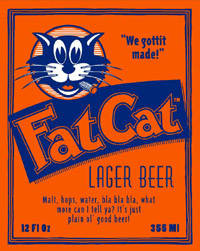
While his designs may conjure up images of simpler days, there is nothing simple about them. "You basically have a three-by-four piece of paper in which to tell your story," he said. Layers, compression and unity are words he uses often in explaining the process, with his goal to tell a story.
The easiest way to see how it works is to visit his website.
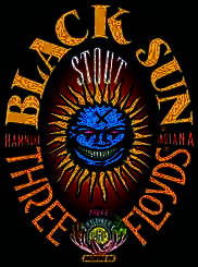
 Among the examples are those for Three Floyds Brewing Co., a suburban Chicago micro that brews very distinctive beers. Mosher designed the equally distinctive labels, but most of the artwork is a product of one of brewer/owner Nick Floyd's friends. Among the examples are those for Three Floyds Brewing Co., a suburban Chicago micro that brews very distinctive beers. Mosher designed the equally distinctive labels, but most of the artwork is a product of one of brewer/owner Nick Floyd's friends.
Then there is the Black Sun Stout label. The artwork for that is a copy of a tattoo on Nick Floyd's arm.
"Nick had the idea of using the tattoo," Mosher said. "He's got phenomenal instincts for the identities of his brands."
Some labels are easier than others.
July 2000
| 
