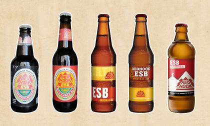
Redhook Brewery is celebrating its 30th birthday by unveiling a new look, including bottles, labels, bottle caps and packaging.
A press release states the new look is all part of Redhook’s effort to get back to its roots. “There seems to be a movement within the craft beer community where a lot of breweries are trying to ‘out craft’ each other,†said Robert Rentsch, brand manager of Redhook Brewery. “Redhook isn’t about that. Of course we’re brewing great beer, but we’re just as interested in having a great time. We think our new look reflects our personality well.â€
Paul Shipman and Gordon Bowker (also co-founder of Starbucks) started Redhook in 1981 in a converted transmission shop in Seattle’s Ballard neighborhood. Of course the brewery — now part of the Portland-based Craft Beer Alliance — grew into a much larger operation, which plants in Woodinville, Wash., and Portsmouth, N.H.
The new look includes:
* Packaging/Labels: Every beer style is identified by a unique color scheme and Redhook’s has added “beer-o-meter” to guide consumers looking for particular flavors.
* Bottle/Bottle Caps: To go back to basics, Redhook created a no-frills bottle, while the bottle caps all depict iconic images and phrases of Redhook’s colorful 30-year history.

I never understood the need to keep changing logos and labels. There is something to be said for tradition. Still I do like the beer.